In the ever-evolving world of automotive branding, a company’s logo and visual identity play a significant role in how consumers perceive the brand. This has become especially evident in the case of Kia Motors, the South Korean automobile manufacturer that underwent a bold transformation with the rollout of its new emblem in 2021. The emblem was designed to signal a fresh era for the automaker — one of innovation, sustainability, and a departure from its former image as simply a budget-friendly brand.
TL;DR
Kia’s rebranding initiative, headlined by the introduction of a new emblem, marked a major shift in the company’s strategic vision. With sleeker aesthetics and futuristic styling, the automaker aimed to reposition itself in the market as a more premium, tech-focused brand. Reactions ranged from praise about the modern look to confusion about legibility, but the impact on sales and brand awareness has been overwhelmingly positive. This case study explores the reasons, design choices, challenges, and outcomes associated with Kia’s bold rebranding move.
Background: Why Kia Chose to Rebrand
For decades, Kia was known predominantly for its affordability and reliability. While these characteristics attracted cost-conscious buyers, they limited the brand’s appeal among consumers who prioritized performance, innovation, and premium design. As the automotive industry began leaning more towards electric vehicles (EVs) and smart, connected car technologies, Kia recognized the need to redefine its market position.
The introduction of the new emblem was not just a visual change — it marked a larger strategic pivot toward electric mobility, sustainability, and advanced vehicle technologies. By enhancing its brand identity, Kia aimed to align more closely with forward-thinking competitors like Tesla and BMW, and to break free from the outdated stereotypes often associated with the brand.
Design of the New Emblem
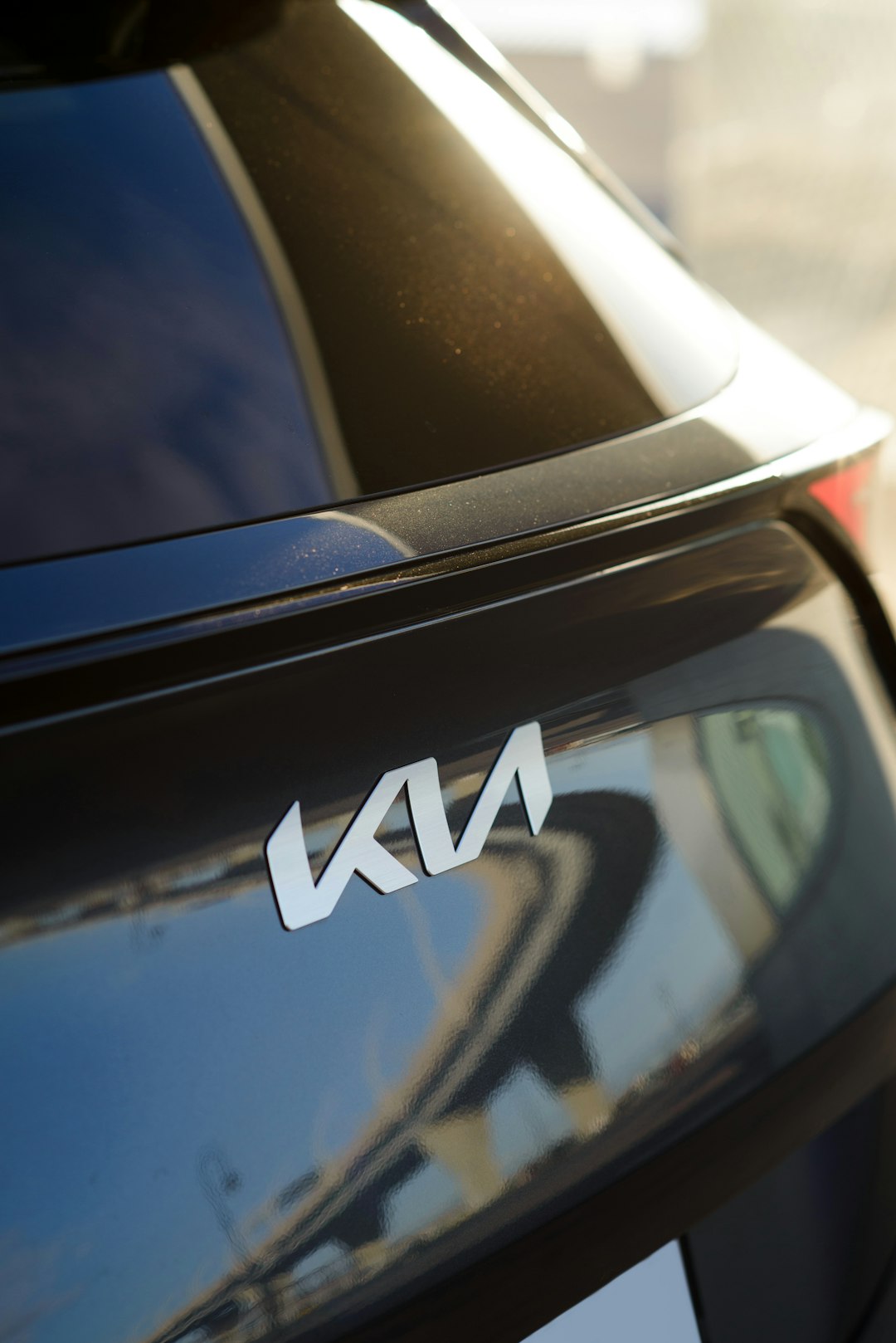
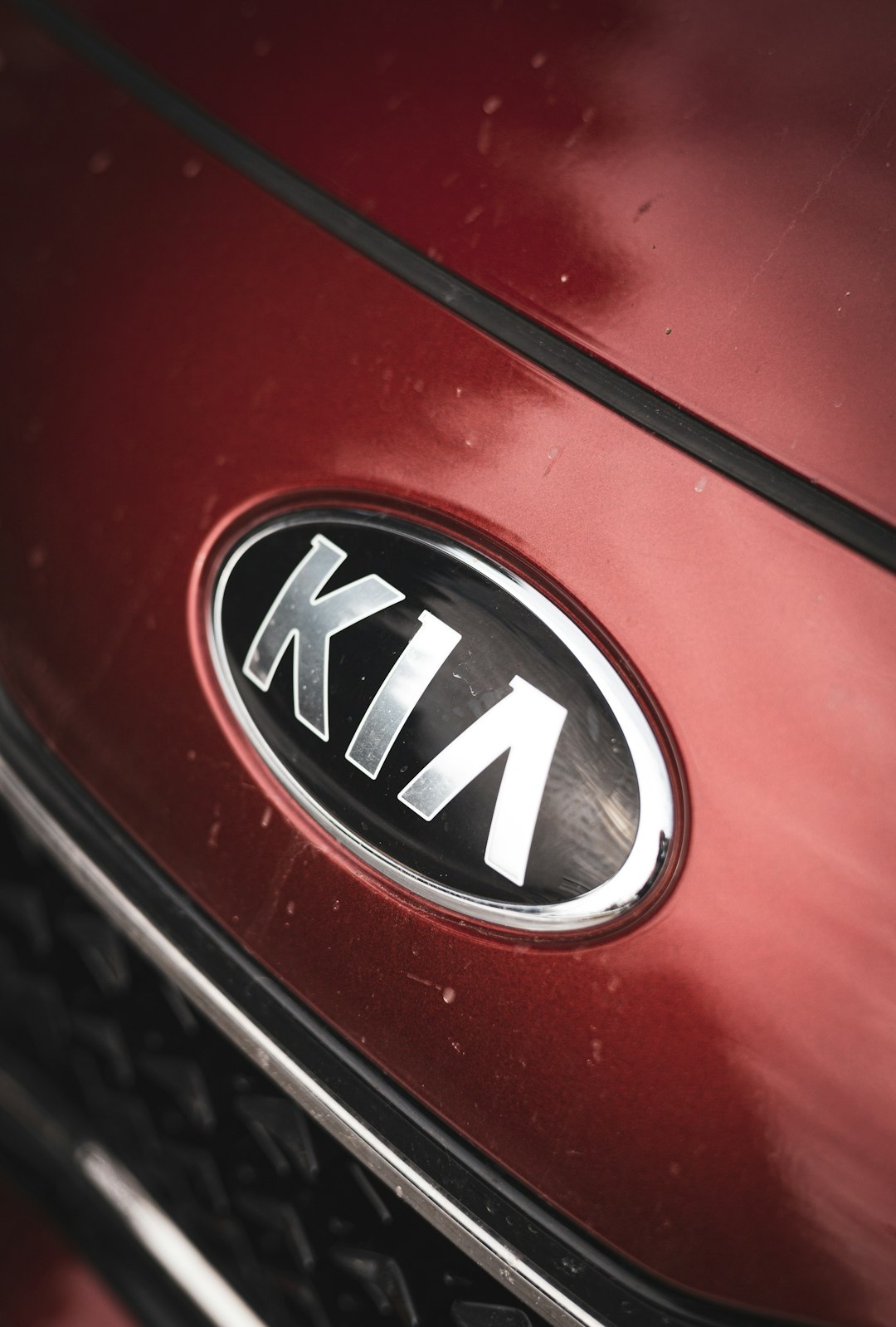
The new Kia emblem features a sleek and minimalist design — a stylized interpretation of the company’s name, with each letter connected in a flowing, almost script-like style. Notably, the new logo omits the circular badge that encompassed the previous design, creating a more open and progressive visual language.

Designed by Kia’s in-house team with input from external design consultants, the new logo reflects what the company calls “symmetry, rhythm, and rising.” The lines are intentionally angled and continuous, giving the impression of forward momentum and futuristic dynamism. However, the design choice of merging the letters has led to an interesting phenomenon: many people misread the new emblem as “KN” instead of “KIA.” While this has sparked some confusion, it has also drawn attention — helping the logo trend on social media and maintain visibility.
Implementation and Launch
The new emblem debuted in January 2021 in a dramatic fashion, with a synchronized fireworks display in South Korea that was recognized by Guinness World Records for the most unmanned aerial vehicles launching fireworks simultaneously. This bold unveiling was part of Kia’s wider brand strategy called “Movement that Inspires.”
Throughout 2021 and 2022, Kia updated vehicles, dealerships, marketing materials, and digital properties around the globe to reflect the new branding. Cars like the EV6, Sportage, and Sorento were among the first to sport the updated badge.
The brand revamp also included:
- A new corporate slogan: “Movement that Inspires”
- A renewed focus on electric vehicles and sustainability
- Intuitive technologies only available in next-gen models
- Redesigned showrooms to reflect a premium atmosphere
Public Reception and Challenges
Reception to the new emblem was mixed at first. While many praised its sleek and stylish appearance, others criticized its legibility. A large portion of internet users, unfamiliar with the context, couldn’t decipher the logo’s letters and began searching for a brand known as “KN car.” This misunderstanding even led Google Search trends to spike with queries for “KN car,” resulting in an unexpected but positive visibility boost.

Despite the confusion, Kia chose not to alter the emblem and leaned into the attention instead. The “KN effect,” as it came to be known, helped keep the brand in public discourse and fueled curiosity which, according to some marketing analysts, amounted to free advertising.
Business Impact and Results
From a business standpoint, Kia’s rebranding has been highly effective. The company reported a noticeable uptick in sales following the rollout of their new-look vehicles, especially electric and hybrid models like the EV6 and Niro. In many markets, the perception of Kia as a tech-savvy, premium automotive brand has started to take hold.
Here are a few measurable outcomes post-rebranding:
- Record global sales: Kia saw consistent year-over-year growth, especially in the EV segment.
- Brand visibility: The modern emblem increased brand recognition by over 20% among younger age groups.*
- Design accolades: The new logo, alongside their new EV models, earned several international design awards including Red Dot and iF Design honors.
Consumers have gradually embraced the new branding, especially as Kia continues releasing tech-rich cars that stand in stark contrast to their previous models. The emblem, while initially misunderstood by some, now aligns with global trends in minimalist, modern design.
Strategic Takeaways
Kia’s rebranding offers several insights for other companies considering a visual or philosophical rebrand:
- Timing matters: Aligning the emblem launch with new product releases (e.g., EVs) amplified the impact.
- Consistency is key: From storefronts to screen interfaces, consistency reinforced the new brand narrative.
- Expect and embrace confusion: Not all feedback will be positive, but even misconstrued information can lead to heightened visibility.
Kia’s transformation is not merely skin-deep. The emblem serves as the visual tip of an iceberg representing innovation, ambition, and long-term planning — a signal that the company is steering itself into the future with confidence.
FAQ: Kia New Emblem
- Q: What year did Kia launch its new emblem?
A: The new emblem was launched in January 2021. - Q: Why did people think the new Kia logo said “KN”?
A: The stylized font connects the letters, which made “KIA” look like “KN” to many unfamiliar viewers. - Q: Has the new logo affected Kia’s sales?
A: Yes, reports show an increase in global sales and brand engagement following the rebranding. - Q: Was the new logo part of a larger brand strategy?
A: Absolutely. It was launched alongside a shift toward electric vehicles and a focus on innovation, under the slogan “Movement that Inspires.” - Q: Who designed the new Kia emblem?
A: It was designed by Kia’s internal branding team, with support from external designers and consulted experts.
Overall, Kia’s emblem change was more than cosmetic; it was a signal of renewed purpose and strategic depth. The evolution of their brand is a textbook example of how visual identity, when properly aligned with business transformation, can play a pivotal role in reimagining a company’s future.


