Dashboards have become an integral part of modern business intelligence tools, offering a centralized view of key performance indicators and metrics. However, many dashboards fail to deliver real value—a situation that stems not from technical limitations, but from design flaws, inadequate consideration of user needs, and a lack of strategic planning. Crafting dashboards that people actually use and rely on requires more than just dropping charts onto a page. It demands a thoughtful, user-centered approach combined with a strong foundation in data literacy and storytelling.
Understanding the Purpose of a Dashboard
Before building any dashboard, it is essential to define its core purpose. Dashboards typically fall into three categories:
- Strategic dashboards – Designed for executives to monitor long-term trends and KPIs at a high level.
- Analytical dashboards – Used for deeper analysis, often intended for data-savvy users who need to explore underlying patterns.
- Operational dashboards – Provide real-time data for day-to-day activities and decisions, often used by frontline employees.
If you don’t clearly define the type of dashboard you’re creating and its audience, it’s easy to end up with a tool that tries to do too much and ultimately fails to do anything well.
Know Your Audience
One of the biggest mistakes in dashboard design is failing to tailor the content and layout to specific users. A dashboard meant for a C-level executive should not look the same as one created for a marketing analyst. Ask yourself:
- Who will use this dashboard?
- What decisions will they make using this information?
- What level of data literacy do they have?
The answers to these questions should guide not only what you show but also how you show it. Using technical jargon or complex charts with non-expert users, for instance, can reduce engagement and hide insight rather than clarify it.

Design Principles That Drive Engagement
Building dashboards that people actually use requires adhering to strong design principles that emphasize clarity, simplicity, and functionality.
1. Keep It Simple
A common mistake is overloading dashboards with too many charts and metrics. While it may seem thorough, information overload leads to confusion and disengagement. Focus on the most critical metrics first. Ask yourself: If the user could only look at this dashboard for 30 seconds, what must they know?
2. Use the Right Visualizations
Select visualizations that match the type of data and the type of insight the user seeks. Avoid defaulting to pie charts or bar graphs—understand the strengths and weaknesses of each option. For example:
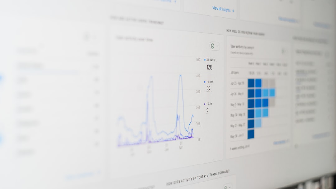
- Line charts are excellent for showing trends over time.
- Bar charts work well for comparing quantities across categories.
- Heatmaps can effectively highlight intensity or performance variations.
3. Prioritize with Layout and Hierarchy
Good dashboards guide the user’s eye naturally through the information. Important metrics should be placed front and center. Less critical, deeper-dive data should be accessible, but not dominant. Use whitespace strategically to organize sections and prevent visual clutter.
4. Optimize for Performance
If your dashboard takes too long to load or lags when filters are applied, users will abandon it. Efficient data queries, compressed image assets, and simplified data sources can play a huge role in ensuring the dashboard is as responsive as it is insightful.
Make It Actionable
A dashboard is only useful if it can drive decision-making. This means the data must be presented in a way that leads naturally to action.
Consider annotating metrics with targets or acceptable thresholds so users can quickly tell whether a value is good or bad. Use color coding consistently—for instance, red for underperformance and green for reaching targets—to signal outcomes clearly. Tooltips with additional context and drill-down options can offer further details without overwhelming the main view.

Test and Iterate
Rarely is the first iteration of a dashboard the best one. Treat your dashboard development process like product design: test it with real users, gather feedback, and improve it over time.
Start Small
Deploy a minimum viable dashboard first. Watch how users interact with it. What do they click on? What do they ignore? Use these observations to guide revisions.
Collect Feedback
Incorporate both analytics (e.g., usage stats, common filters applied) and qualitative input (e.g., user surveys, interviews). This hybrid approach ensures your improvements are grounded in reality—not just assumptions.
Avoid Common Pitfalls
Even with the best intentions, it’s easy to fall into traps that limit effectiveness. Watch out for these common mistakes:
- Over-customization – Trying to solve every user’s problem in a single dashboard breeds complexity. Create tailored views instead.
- Inconsistent metrics – Use a centralized data dictionary or KPI definition sheet to keep everyone aligned.
- Lack of contextual metadata – Users should never wonder where a number comes from or what it means. Provide definitions and data sources within the dashboard.
Maintain and Update Regularly
Dashboards are not “set it and forget it” tools. Business needs evolve, goals shift, and data sources change. It is crucial to build a maintenance plan that includes:
- Data validation checks to ensure the dashboard reflects accurate and up-to-date information.
- Review cycles to assess whether the metrics tracked are still relevant.
- User feedback channels to collect ongoing suggestions for improvement.
Nothing diminishes user trust faster than stale data or broken elements in a dashboard. Maintenance is not an afterthought—it is a continual investment in data credibility and utility.
The Role of Storytelling
Numbers alone do not create understanding—stories do. The best dashboards don’t simply display metrics, they weave those metrics into a narrative. Ask:
- What story is this dashboard telling?
- Does each chart support and build upon that story?
- Is the user guided toward conclusions rather than left guessing?
Using a headline plus supporting charts is a good approach. For example, a dashboard section titled “Sales Have Rebounded Since Q2” followed by a line chart showing monthly growth helps users understand context and progression. Combine visual storytelling with clear labeling to clarify takeaways.
Conclusion: Making Dashboards People Trust and Use
Ultimately, a successful dashboard bridges the gap between raw data and informed action. It is rooted in user needs, designed with clarity, and evolved through feedback. Only dashboards that provide immediate value, ongoing usability, and credible insight will gain adoption and trust.
To recap, building dashboards people use means that you:
- Define the dashboard’s purpose and audience clearly.
- Follow strong design principles for layout, visuals, and clarity.
- Focus on driving action, not just reporting numbers.
- Test, iterate, and improve over time.
- Keep the dashboard accurate, maintained, and relevant to users’ current needs.
Dashboards are not just reports; they are products. Treat them with the same care and rigor you would apply to any tool designed to shape behavior or drive decisions. In doing so, you create more than just a dashboard—you provide a trusted window into the operation and performance of your organization.


