


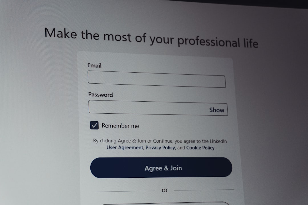
Ever filled out a form online and seen that little mysterious box labeled “Address Line 2”? If you’ve ever wondered what it’s for, or when it should actually show up, you’re not alone. Let’s dive into the world of form logic — in the funnest way possible!
What is Address Line 2, Anyway?
Before we talk logic, let’s clear this up:
Address Line 2 is an optional field in many online forms. It helps users give extra details about their address. Think of it as a bonus line, not a must-fill.
Here’s what people typically type there:
- Apartment numbers (APT 304)
- Suite numbers (Suite 12B)
- Unit numbers (Unit 6)
- Floor levels (3rd Floor)
- Building names
- P.O. Boxes

Still, a lot of people skip it — and that’s okay. Not everyone needs to enter something there. That’s why smart forms know when to show it and when to hide it.
Why Not Just Always Show It?
Good question. Here’s why:
- Too many fields at once can feel cluttered
- Most users don’t need it, so it’s wasted space
- Less confusion means faster form completion
Simplifying the form makes users happy. And happier users mean more completed forms!
So When Should It Show Up?
Here’s where smart design comes in. You can use logic — simple rules — to make the form feel magic. It shows users what they need, when they need it.
Condition-based field visibility is the trick.
Show Address Line 2 when these happen:
- User enters “P.O. Box” in Address Line 1
- User selects “Apartment” or “Suite” from a drop-down with residence types
- User enters a known multi-unit building
- User hovers or clicks near where Address 2 would appear
For example:
Form asks: “Do you live in an apartment, suite, or unit?”
If user says “Yes,” bam! Address Line 2 appears.
Hide Address Line 2 when:
- Address doesn’t need extra info
- User selects “House” or “Single-family home”
- Form is in Quick Mode for speed entry
This helps keep things sleek and friendly. People feel like the form “gets” them.
Real-World Examples
Let’s break down some real uses of smart logic in forms:
Example 1: E-Commerce Checkout
Many online stores hide Address Line 2 by default. But once you start typing something like “APT” or “Unit” into Address Line 1, Address Line 2 magically appears.
Example 2: Mobile Optimization
On small screens, space is precious. So hiding extra fields makes the form feel cozy. Address Line 2 can appear in a slide-in animation after the user answers a related question.
Example 3: Hotel Booking
Some booking sites ask guests where they live. If you click a button saying “I’m staying at my apartment,” the form knows to offer extra room for suite numbers or building names.
Pretty cool, right?

Don’t Confuse the User!
One major mistake? Making users guess what Address Line 2 is for. If you’re going to show it, be clear about what it’s for:
- Use helper text like: “Apartment, Suite, Unit, Building, Floor, etc.”
- Or pre-fill it in gray: “e.g., Apt 5B”
That way, users know when and how to use it.
Tips for Developers and Designers
Want to build better forms? Here’s what to keep in mind:
- Start With User Intent:
If users don’t expect to provide extra info, don’t show Address Line 2. - Use Analytics:
Look at form drop-off rates. If users leave your form at the address step, maybe there’s too much going on. - Test Regularly:
A/B test layouts that include or hide Address Line 2 conditionally. Pick the one users love most. - Default to Optional:
Never make Address Line 2 required. It’s like asking everyone to wear glasses. Not everyone needs them! - Keep It ADA-Friendly:
Make visually hidden labels for screen readers so everyone can access the form — even if it appears or disappears.
Pro Tip: Autofill Smartness
If you use browser autofill features, be sure your fields are labeled properly.
Use the field name address-line2 so browsers know where to place leftover address goodies like “Suite 402.”
Incorrect field naming can mess up autofill and lead to bad data. Let autofill be your friend, not your enemy.
More Than Just Logic: It’s User Empathy
Smart field logic isn’t only about code. It’s about understanding your users.
Imagine you’re renting an apartment in a 20-floor building. You need Address Line 2 to help your pizza find you. But if you live in a cottage? One line is all you need.
That’s empathy. That’s what great UX is made of.
Final Thoughts
Let’s wrap it up. Address Line 2 isn’t evil. It’s just misunderstood.
With the right logic and smart design, it can appear when needed — and stay hidden when not.
Because no one wants an address that looks like this:
1234 Main St Address Line 2: (Not sure what to put here, help?)
So next time you’re designing a form, ask yourself:
- Does the user really need this field?
- Can I guide them better with a question?
- What’s the easiest experience for them?
Because smart forms are like smart homes — they react, adapt, and make people smile.
Now go forth and make those forms legendary!